It’s always a great delight when you get to help someone design/choose fittings for a new home when they share your personal taste and style in furnishings. A mix of mid-century and Asian antiques blend seamlessly with modern touches in this stunning home (a Gold Reserve finalist in the national Master Builders House of The Year 2019 and Regional LifeStyle Award winner).


I was already familiar with many of the main furniture pieces such as the two sofas, armchairs, dining suite and collection of antique Chinese cabinets. So together we chose a colour palette of teals, greens and ochre as a base to pull through and complement these existing items.


A mix of teal and ochre textured cushions sit on the 1950s tan leather and concrete grey sofas as well as the windowseat alongside the stained glass window. The old ottoman was reupholstered in Mokum’s Molokai - a lovely velvet jacquard.
At the north end of the living room is a custom designed stained-glass window, based on the tulip flower (a quiet nod to one of the owners Dutch heritage) Over the dining table we used Graypants Scraplights from ECC. These are handmade in Holland from corrugated cardboard with each one individually signed by its maker. They cast a stunning filtered light that has to be seen to truly appreciate.


Many pieces were sourced for uniqueness and sustainability something very important to the owners. Lighting was especially important to the owners who prefer a softer ambiance and the use of lamps. I recall their apartment in London had no overhead lights at all in the living room. Only floor and table lamps were used.
Linen sheers line the two sides of the living room, filtering light and adding privacy when needed. These hang from a recessed double track and are backed with a dim out fabric to pull separately in winter. *Recessed tracks are put in at the same time as gib as they need extra support - another reason to engage an interior designer very early in the building process. They give a full floor to ceiling drape without a visible mounted track. Perfect if you want clean lines.

In the kitchen the richly grained oak timber was stained in a walnut colour - chosen to tone with the mahogany/teak dining table and frames of the 1950s furniture.
The owners chose a stunning piece of forest and emerald green stone veined with gold for the bench top and splash back. There was enough left over to top the two Chinese cabinets that have been used back to back with a square table - forming the kitchen island. This creates another usable work surface.

In the master bedroom beautiful handblown glass pendants from Monmouth studio hang beside the bed, negating the need for lamps. One of the things I found amusing as the owner proudly showed them to me one day in a magazine. I had shown them to her previously well over a year before (good taste). The gorgeous dusky tea colour offsets the olive-green open weave semi sheer drapes. (Designs of The Time - Adahy from James Dunlop)


In the ensuite another chinese cabinet was repurposed to use as a vanity. This was topped with a vessel basin and a piece of acrylic from Marbello to protect from water damage. The soft cream colour was chosen to work with the full height tile along the shower and end wing wall that hides the toilet. A mirror made the same size as the window was used to keep the balance. Good makeup lighting was installed (this is so often overlooked in bathrooms - a good lighting designer is essential).

Downstairs houses a further two bedrooms (one used as a study). Echoing the same palette from upstairs for cohesion, the study features a handy daybed housing a pile of inviting cushions and the window is adorned with a stunning soft mustard linen sheer. My dream desk resides in this room. One day I hope to convince them to part with it but I don’t think I’ll have such luck. The Rituals wall sconces along the block wall and matching ceiling mount light by Foscarini cast a soft glow from the stunning textured glass.
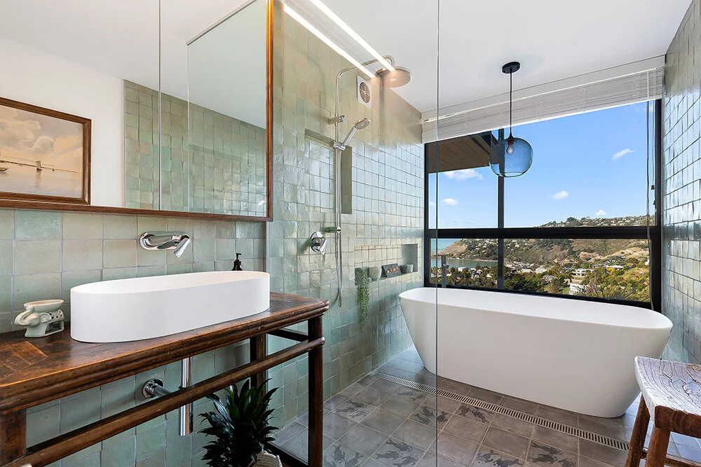
In the bathroom the owner had sourced some stunning handmade wall and floor tiles from Morocco. The wall tiles in shades of pale green almost have an iridescent shell like effect. After much deliberation and samples she/we chose a simple two tone version for the glaze of the floor tiles. There were options to have several colours of fish on one tile but simple was better. The feature fish tile was placed randomly among the plain version. The kitchen joiner made an oak mirror frame to match the antique console used as a stand for the basin. The separate toilet features another ocean inspired design taken from a handmade/printed wall paper that ended up failing in application. It was disappointing but I managed to hand paint the design back on the wall after we had it removed and repainted.